
Home
Account setting
Staff
Lists
Forms
Templates (HTML emails/SMS messages)
Sending messages by SMS and email
Classes, events, attendance and Zoom
Automation
Create a birthday invitation and automation
Communication
Microsite
E-Commerce
Networks, Federations and Franchises
How to guides
Personal information and electronic message laws in Canada and the USA
Get support
Terms and conditions
RL-24
https://activitymessenger.com/
10410 Waverly, Montréal, H3L 2W4
Terms and conditions

Add sections, blocks, and layouts
A website page is assembled from sections. Choose a ready-made section template for a complete design, add an Activity Messenger block for platform content, or use a container when several blocks need to share a row.
# Open the section library
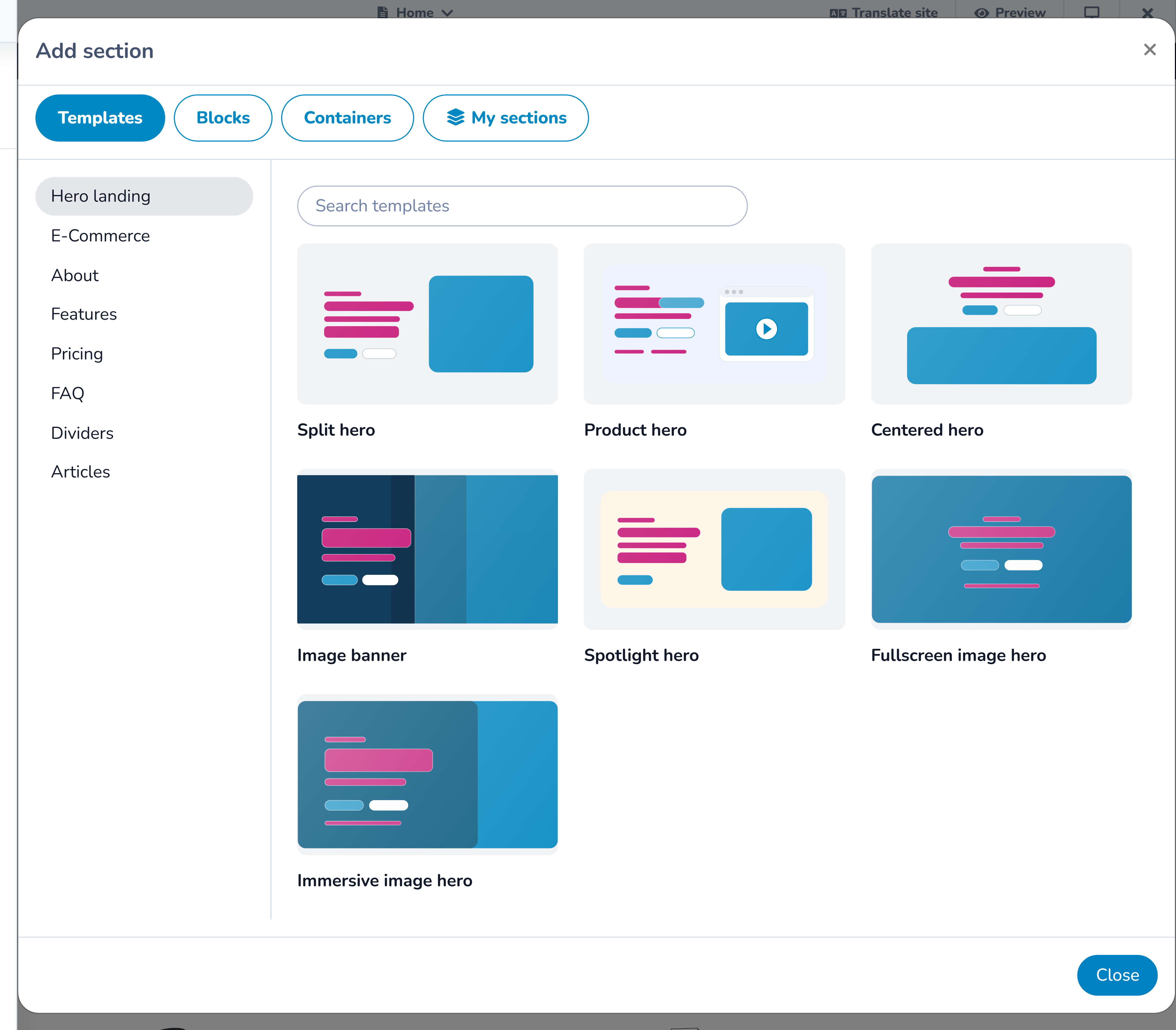
In the Website builder, select Add section on an empty page or select a plus button before or after an existing section. The library contains four tabs:
- Templates for complete, editable website sections;
- Blocks for Activity Messenger content and utilities;
- Containers for arranging one or more blocks in a custom row; and
- My sections for designs your organization has saved for reuse.
You can return to the library whenever the page needs another section.
# Choose a section template
Templates combine layout, content fields, repeated items, and responsive styles. Start with the purpose of the content rather than its current appearance.
Available template groups include:
- Hero for the opening message, image, and primary action;
- About for stories, values, team members, media, or checklists;
- Features for benefits, statistics, links, reviews, schedules, calls to action, logo walls, and other promotional content;
- Pricing for plans and included features;
- FAQ for questions and answers;
- Divider for visual separation;
- Blog articles for grids, lists, or a featured article;
- Ecommerce for product or booking presentations; and
- Layouts for pre-arranged content areas.
Select a card to insert it. The library creates the section with starter content so you can see its structure immediately.
Edit a template
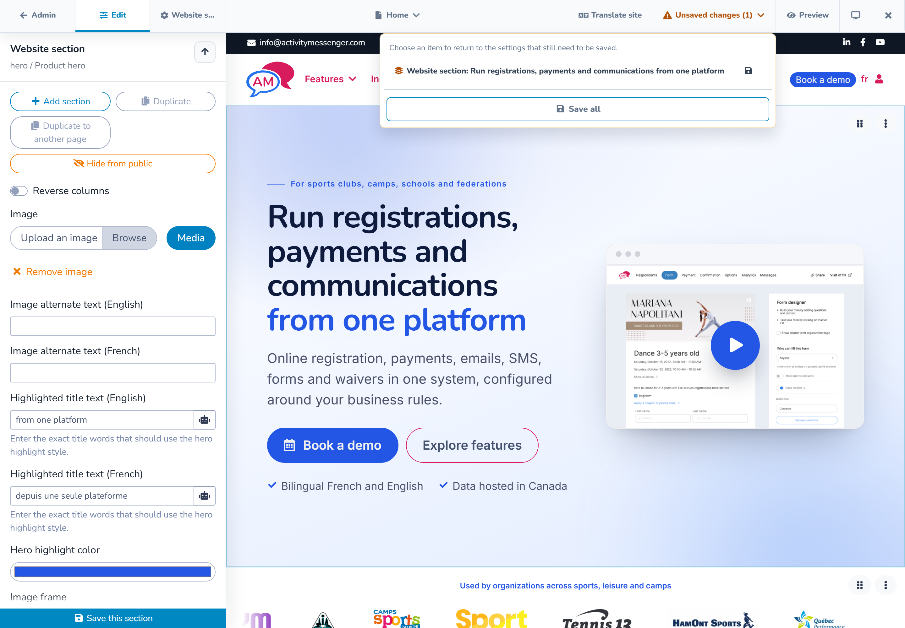
Click the new section in the preview. Its inspector can include:
- headings, body copy, labels, and buttons;
- images, video, alternative text, captions, and overlays;
- repeated items such as features, people, plans, FAQs, or schedule entries;
- background, text, accent, and button colors;
- padding, content width, corners, borders, and card styles; and
- supported entrance or hover effects.
Click visible text, images, or repeated items in the preview to open the most specific field. Use the inspector's up arrow to return to the item or section above it.
Select Save section when finished. The top bar's Unsaved changes menu confirms whether the section still needs to be saved.
# Add an Activity Messenger block
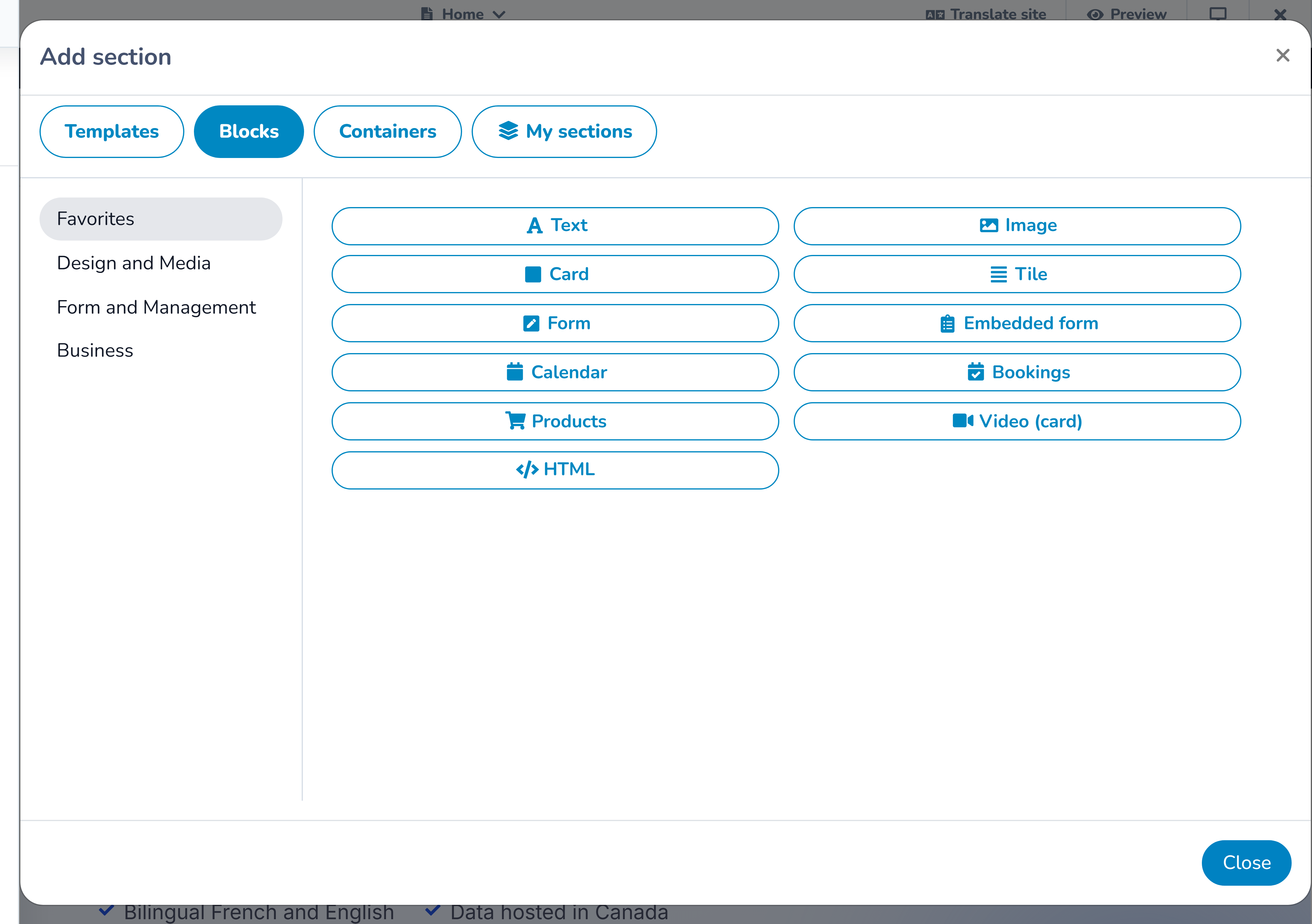
Use a block when the page should display or launch content managed elsewhere in Activity Messenger. Depending on the organization's modules, blocks can include:
- forms, documents, maps, locations, and form answers;
- calendars, registrations, bookings, products, packages, and account actions;
- member directories, teams, attendance, or staff and client access;
- text, cards, images, video, audio, slideshows, tables, tabs, links, search, or alerts; and
- embedded or custom HTML content.
The block library only shows choices available to the organization and the current context. If another organization has a block you do not see, compare enabled modules and permissions. Do not substitute custom HTML for a missing business feature until the module and source content have been checked.
A standalone block is useful when it should occupy its own section. Select the block, complete its source and display settings, and use Save block.
# Arrange blocks with a container
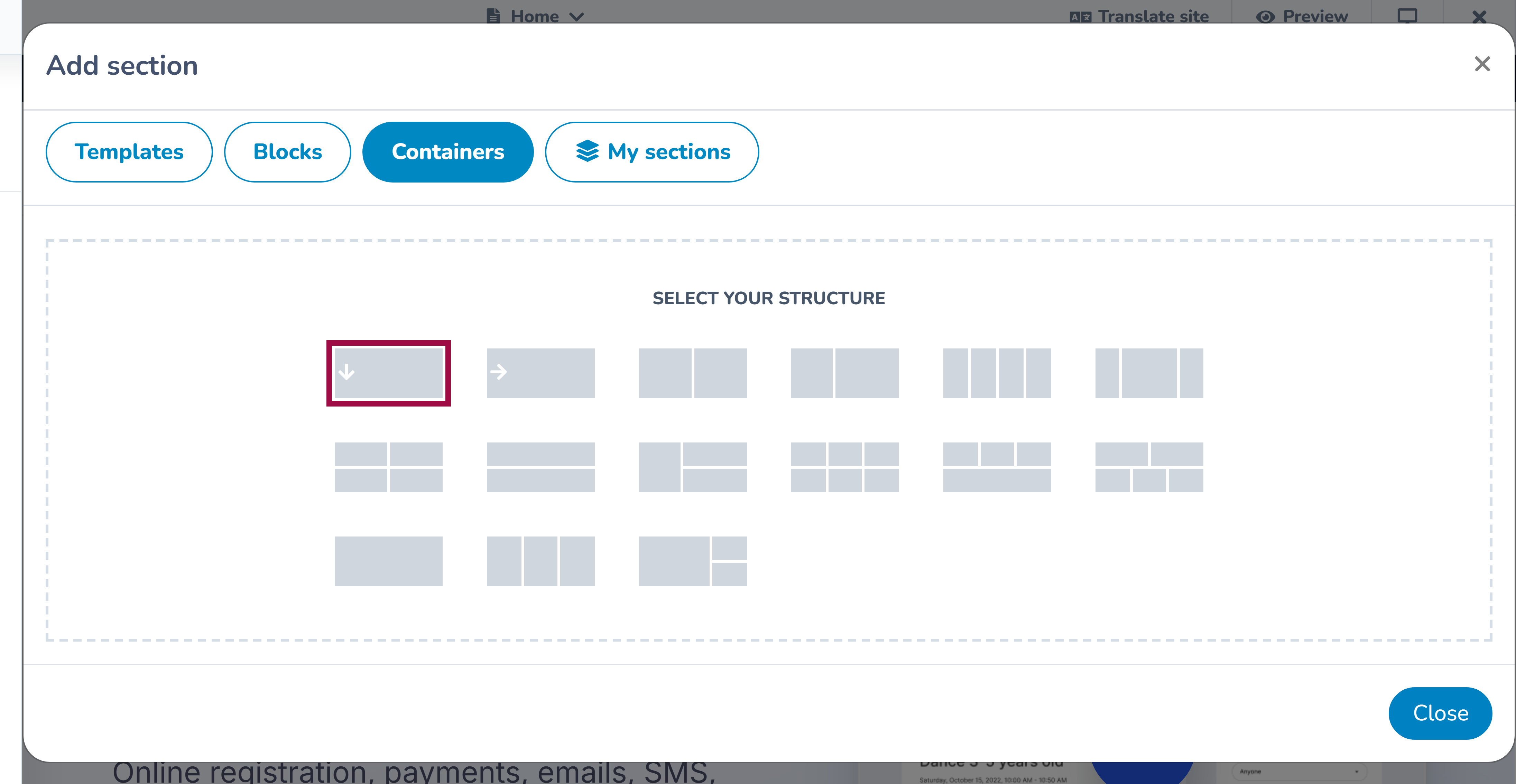
Choose a container when several blocks should appear in one section. After adding the container:
- insert a block into an empty container area;
- add the other blocks needed for the row;
- choose supported widths such as one quarter, one third, one half, two thirds, three quarters, or full width;
- adjust block alignment where available; and
- save each changed block and the section.
Some complex blocks must remain full width. If the editor expands a block or prevents an unsupported combination, keep that structure and choose a different row for the surrounding content.
Fractional widths describe the desktop layout. At smaller widths, blocks may stack to remain readable.
# Rearrange or reuse a section
Open a section's actions to:
- drag it to a new position;
- duplicate it on the same page;
- duplicate it to another page;
- hide it from the public page;
- save it to My sections;
- detach it from a synchronized saved section; or
- remove it.
Hiding is useful for seasonal content: the section stays visible to editors with a hidden badge but is omitted from the public page. Removing deletes it from the page instead.
Use My sections when the same design should be inserted elsewhere. A saved section can be an independent copy or a synchronized section; see the reusable-sections guide before choosing.
# Check the responsive result
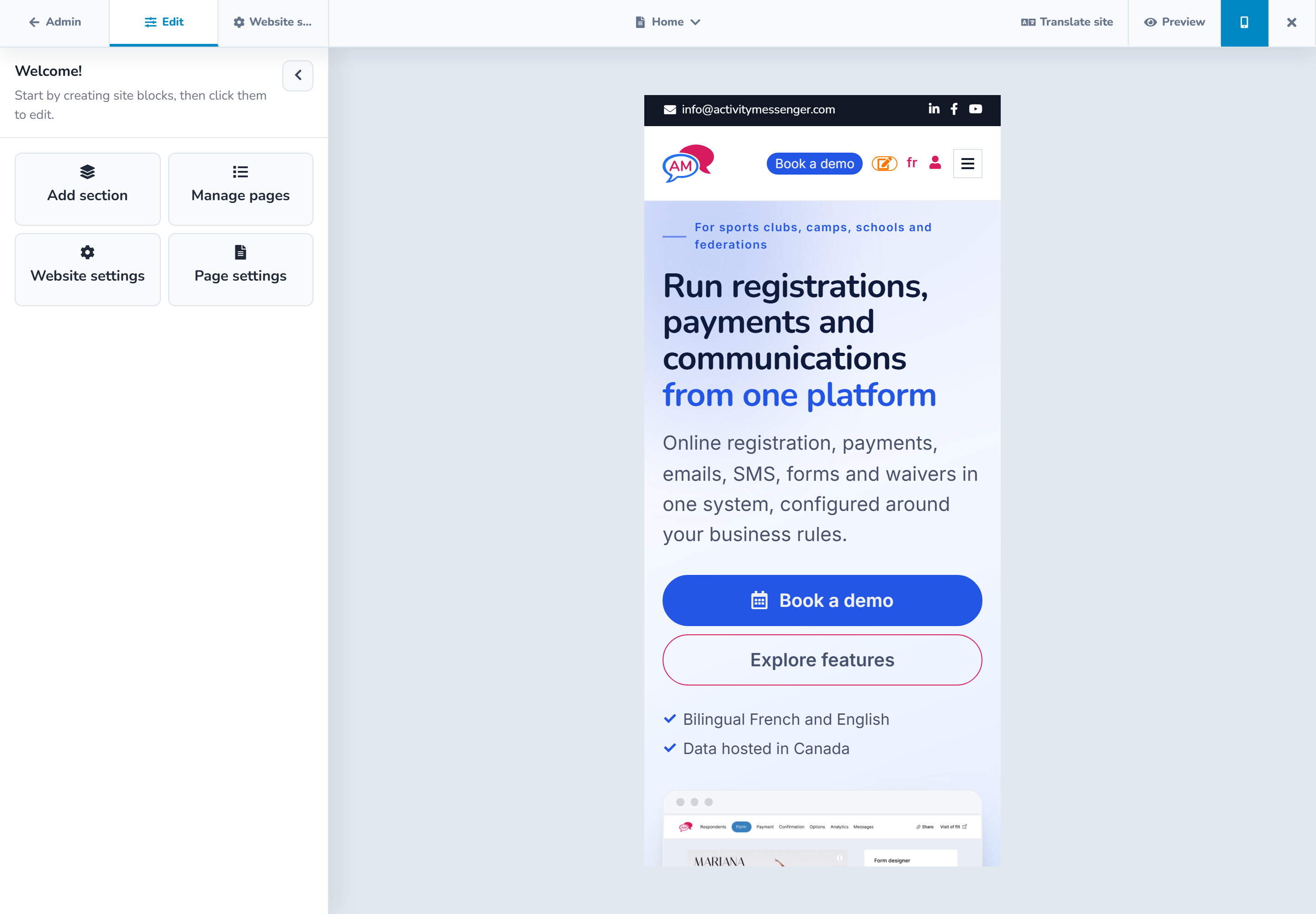
Preview the page at all three sizes in the top bar:
- desktop;
- tablet at 768 × 1024; and
- mobile at 390 × 844.
Use realistic content during review. Check particularly:
- long English and French headings;
- button wrapping and spacing;
- columns and container blocks stacking;
- image crops and alternative text;
- tables and other dense content for horizontal overflow; and
- the order in which content is read on mobile.
The separate Preview action opens the page without the editor chrome. Signed-in editors can use it for a draft page, but the page is not public until it is published.
# Example
For a program page, start with a hero template, add a feature grid for the benefits, use a two-block container for a schedule and location, and finish with a form block. On mobile, confirm the schedule and location stack in a sensible order and that the form action remains easy to find.