
Home
Account setting
Staff
Lists
Forms
Templates (HTML emails/SMS messages)
Sending messages by SMS and email
Classes, events, attendance and Zoom
Automation
Create a birthday invitation and automation
Communication
Microsite
E-Commerce
Networks, Federations and Franchises
How to guides
Personal information and electronic message laws in Canada and the USA
Get support
Terms and conditions
RL-24
https://activitymessenger.com/
10410 Waverly, Montréal, H3L 2W4
Terms and conditions

Design the website header, footer, and global styles
Use Site settings to keep the website consistent across pages. Configure the site's navigation, typography, reusable colors and section defaults, then add the shared header, footer, top bar, and optional visitor popup.
# Open Site settings
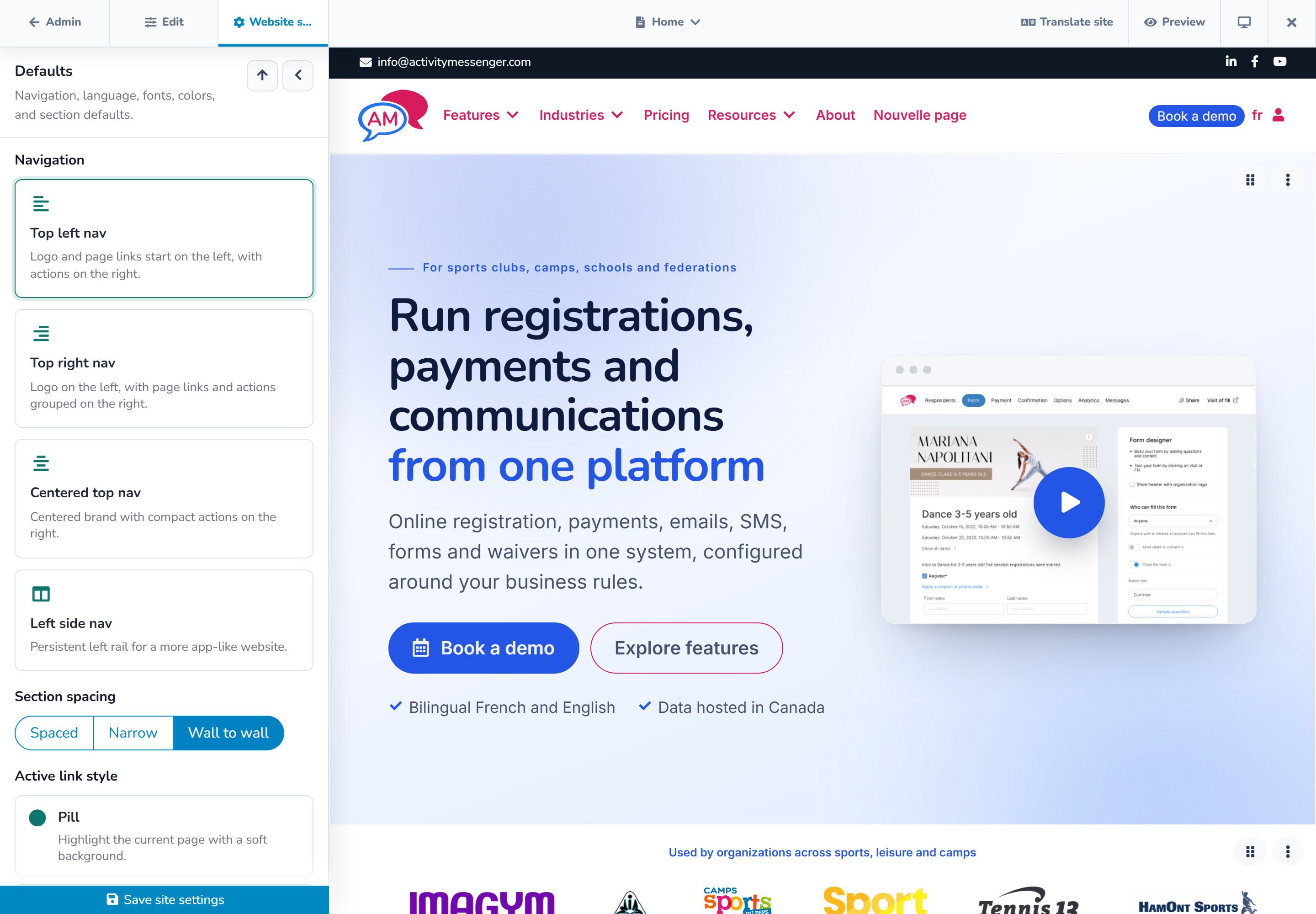
In the Website builder, select Site settings in the top bar. The inspector contains site-wide defaults and shared site blocks. Save each changed group, or use Save all from the unsaved-changes menu.
Site settings affect the current website. If the organization manages several websites, confirm the website name and address before changing its brand or shared content.
# Set navigation and website defaults
The main settings include:
- navigation layout: top left, top right, centered top, or left side;
- active-page style: pill, underline, or bar;
- default space between sections: spaced, narrow, or wall to wall;
- primary and bilingual language settings;
- the Activity Messenger subdomain;
- website-wide search-engine exclusion; and
- typography and reusable color swatches.
Changing the subdomain changes public links. Update messages, bookmarks, QR codes, and external links after the new address is saved.
The website-wide Exclude from search engines option adds noindex instructions to every page and removes the site from its sitemap while enabled. It does not make the site private. Use publication status or password protection when access must be restricted.
# Build a consistent design system
Choose a body font for paragraphs and controls and a display font for headings. A custom font can use a CSS font-family value and an optional trusted stylesheet URL.
Add frequently used brand colors as website swatches. Editors can then select them quickly in supported color controls. A website can keep up to 24 unique swatches.
Set defaults for supported section templates:
- title, body, accent, and background colors;
- heading and body text sizes;
- button shape and hover style; and
- card shadow strength.
Understand defaults and overrides
A section using a site default follows future changes to that default. A section with its own selected value keeps that override.
For example, changing the website's default title color updates sections that inherit it. A campaign section with a manually selected white title remains white. Open that section's design controls and return the field to its default or inherited choice when it should follow the site again.
Use section-level overrides deliberately for exceptions, not as the main way to reproduce the brand on every page.
# Configure the top bar
The optional top bar can display shared contact and social destinations, including email and phone. Use concise information that remains useful on mobile. Test each link, including telephone and email actions, in the public preview.
# Configure the header
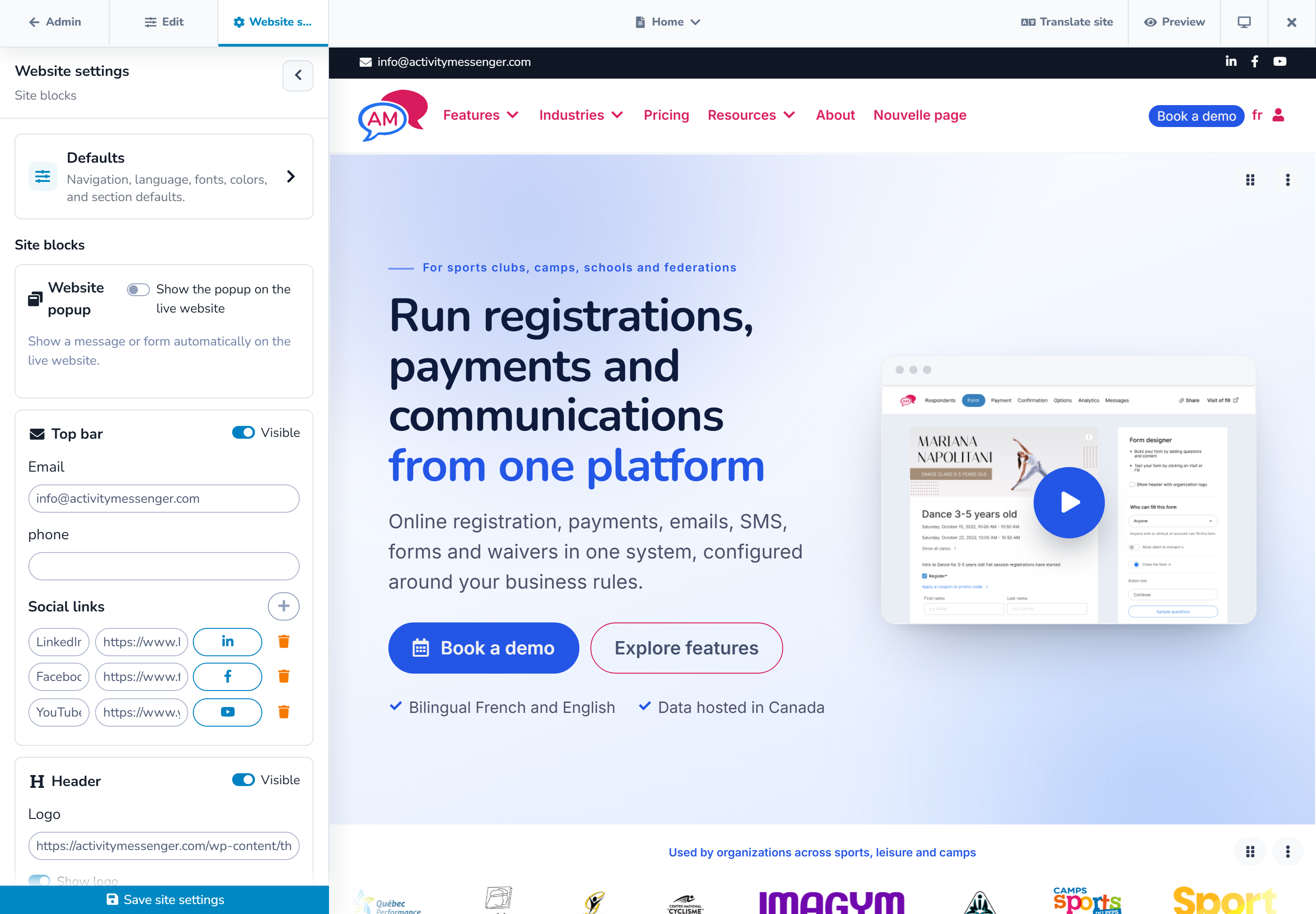
The header can include:
- the website logo;
- page navigation;
- the language switch on a bilingual website;
- the shopping cart when applicable;
- a client-account action with a custom label and URL; and
- a primary action button.
Keep the primary action short. If both the account action and primary button are enabled, verify that the header still fits at tablet and mobile widths. The selected navigation layout determines how these elements are arranged.
# Configure the footer
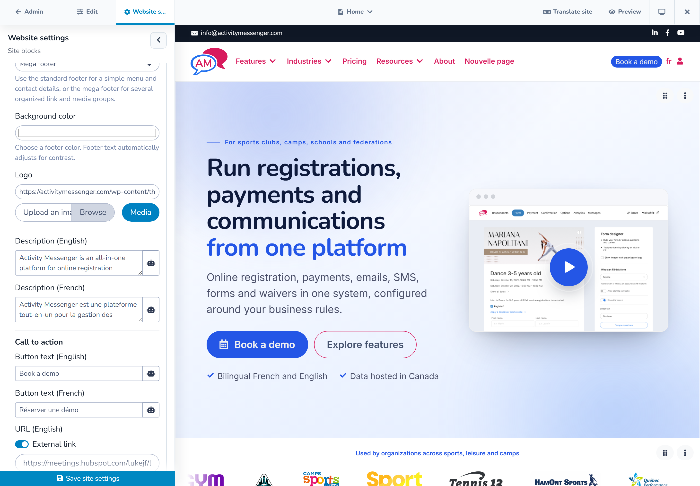
Choose the footer type that matches the amount of information:
- Standard footer for a logo, description, newsletter, core links, address, social links, and legal information.
- Mega footer for a larger call to action, multiple link groups or columns, supporting logos, social links, legal links, and a detailed bottom row.
Complete the localized text and links for both languages. The footer supports a year token so the displayed copyright year can stay current without annual editing.
On mobile, confirm that columns stack in a clear order and that long addresses and link labels wrap without horizontal scrolling.
# Add a website popup
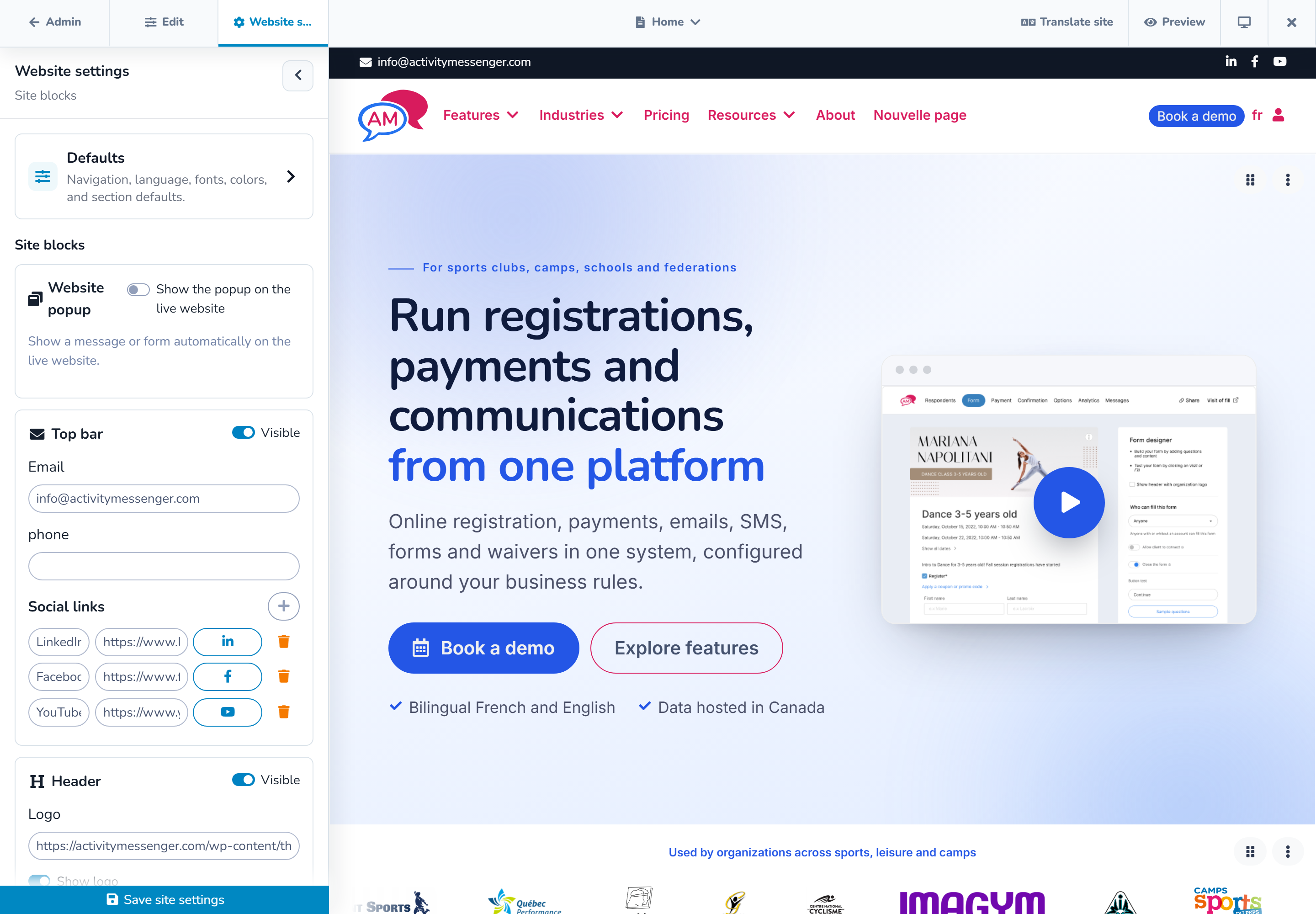
The website popup can contain formatted text or an embedded Activity Messenger form. Configure:
- the localized title and content or form;
- a delay from 0 to 60 seconds; and
- whether it appears once per browser session or again after a selected number of days from 1 to 365.
Use the popup preview inside the editor. The automatic popup is intended for the live website, so test it again on the public page after publication.
Avoid using a popup for information every visitor must read immediately. Provide critical accessibility, cancellation, or safety information in the page itself.
# Use advanced settings carefully
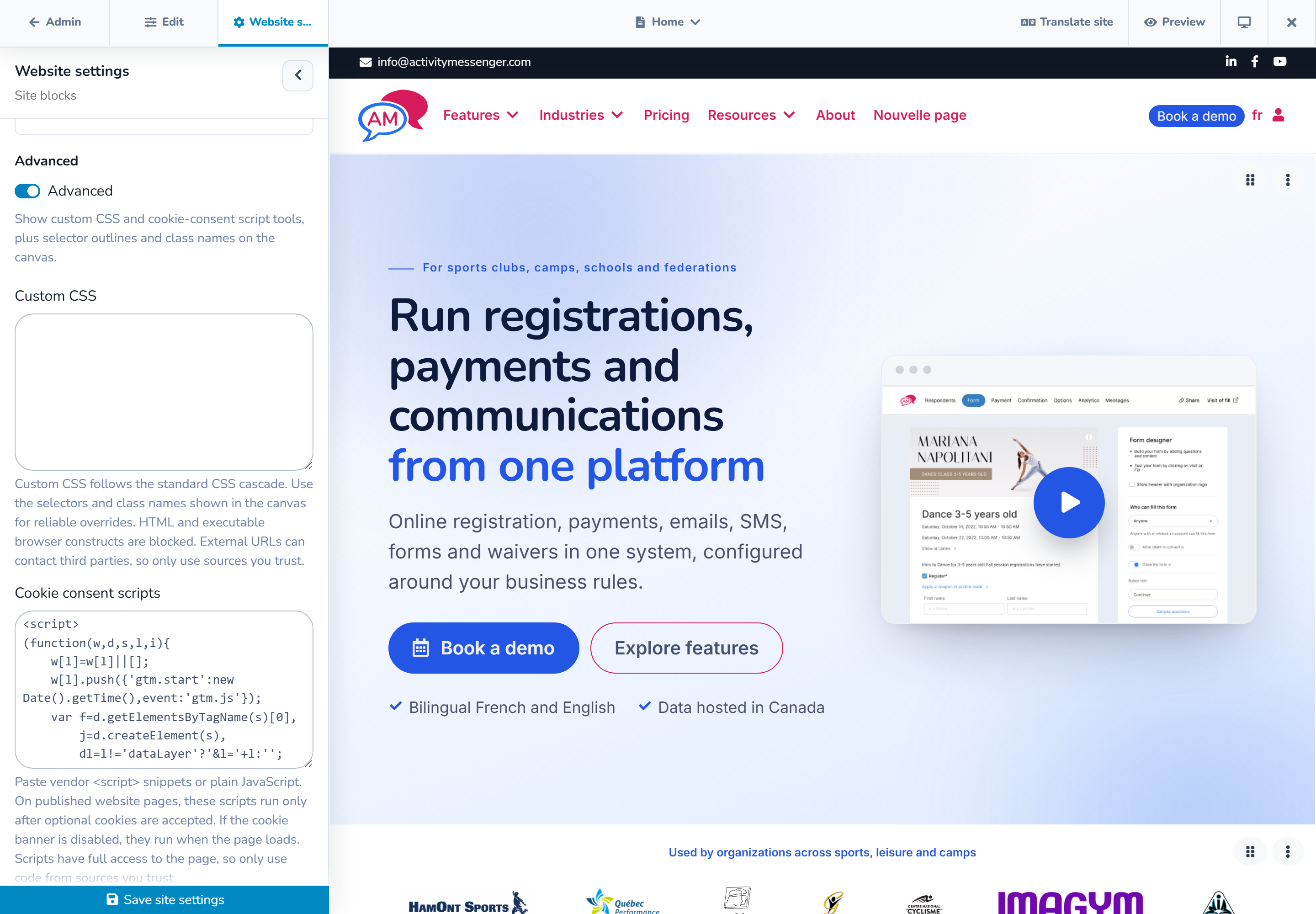
Custom CSS
Custom CSS can refine the website when the built-in settings are not enough. The field accepts CSS only, up to 50,000 characters. It rejects HTML and executable constructs.
Limit rules to the website elements you intend to change. Test desktop, tablet, and mobile after every update. Custom rules can override responsive styles or reduce contrast, so document the purpose of each rule for future editors.
An external font stylesheet is a third-party request. Use a source your organization trusts and is permitted to load.
Cookie-consent scripts
Advanced settings can load either a vendor script URL or custom JavaScript for services such as analytics or visitor tools. Treat this code as having access to the full public page.
- If the optional cookie banner is enabled, the configured code runs only after the visitor accepts optional cookies.
- If the cookie banner is disabled, the code runs when the page loads.
Only add scripts supplied or approved by a trusted administrator. Confirm the organization's privacy obligations, update its notices when necessary, and test that declining optional cookies prevents the script from running.
# Final review
Before publishing, check:
- every header and footer link in both languages;
- logo and favicon quality;
- navigation and actions at all preview widths;
- text contrast and focus visibility;
- popup timing and recurrence;
- inherited styles and intentional exceptions; and
- consent behavior for any third-party script.