Remember when you had to call or go in person to register your child for an activity?
You spoke to a friendly voice, answered a few questions, and someone walked you through each step.
It felt personal, direct, with help every step of the way.
But it was also inconvenient and time-consuming.
———————–
Over the past 15+ years, as registration moved online, we traded personal touch for efficiency.
Suddenly, human interaction gave way to scrolling through endless lists of classes.
And sure, the convenience of being able to register at any time is great.
But at what cost?
In this article, we’ll discover how modern online registration software is taking a new approach.
We’ll discuss:
A decade ago, my partner and I started our kids’ sports business.
We spent countless hours on the phone walking people through the enrollment process.
The process was cumbersome, and the same questions kept coming up over and over.
————–
Fast forward to today and you’ll find that many organizations are still struggling with the same challenges.
Too often, we have to email/call our customers to help them.
But it doesn’t have to be this way.
Activity Messenger is a modern class management software for swim schools, summer camps, gymnastics clubs and dance studios.

Let’s use the iconic Yahoo vs. Google rivalry to compare with the online registration software market.
Pioneers, to be sure, but just like Yahoo’s cluttered home page that complicates the search experience, these platforms are inundated with never-ending lists of programs, camps, and schedules.
Their outdated interfaces turn navigation into a maze that confuses rather than helps.
Modern platforms embrace the simplicity, speed, and innovation that catapulted Google to the top.
With a clean, minimalist and customer-centric registration path, Activity Messenger makes it easy to find the right class.
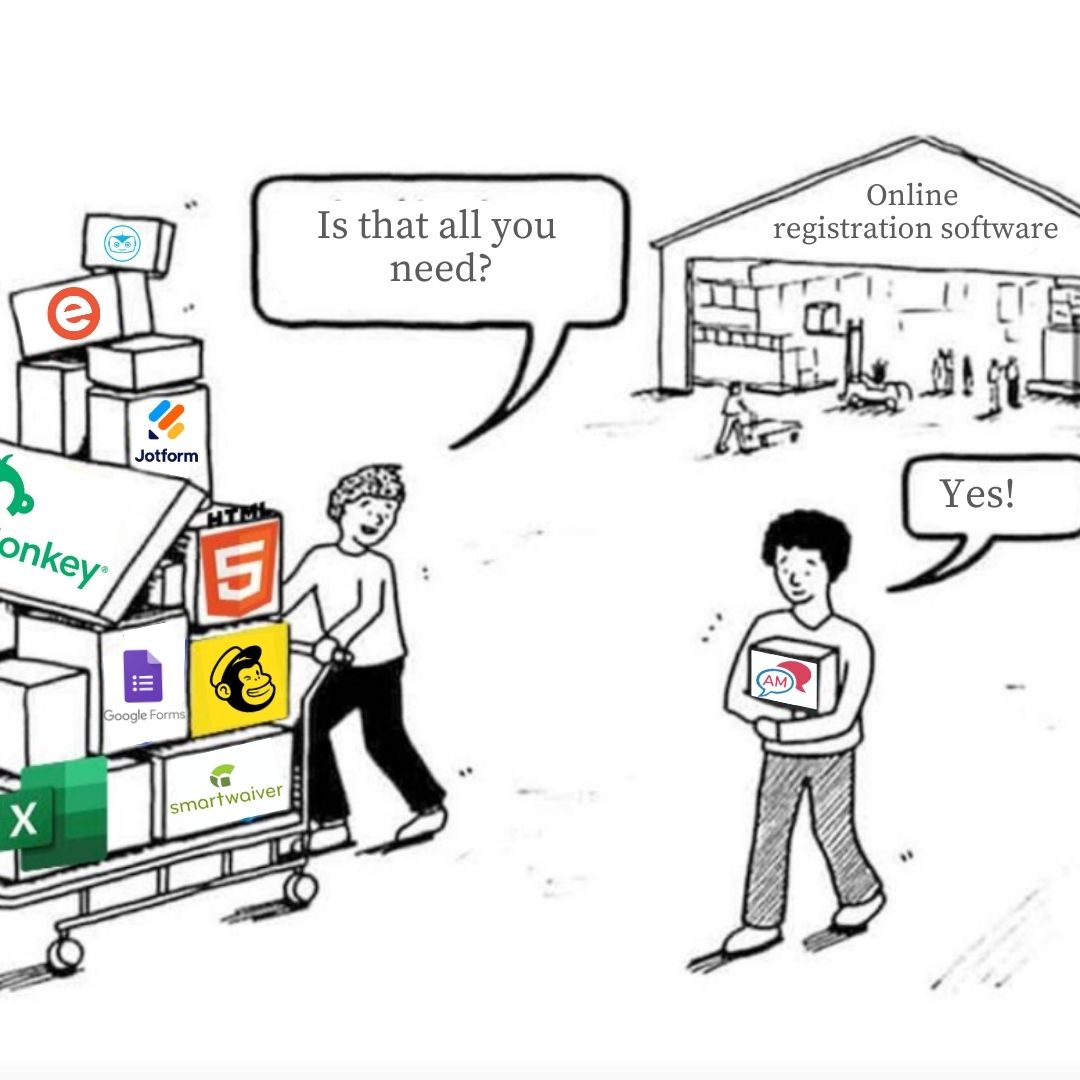
And much like Google’s diversification into Gmail, Maps, and News, Activity Messenger also offers tools that replace Mailchimp, SurveyMonkey, Eventbrite, and SmartWaiver.
Think about a recent call where you helped a client find a class.
You probably asked them questions like
These questions quickly lead you to the right option for that specific family.
Yet, with current registration software, customers often navigate endless class options from their smartphone.
They get lost in the choices and struggle to find answers quickly.
Especially new clients.
Some figure it out. Others email you for help.
But some just leave, and you just lost a client.
We believe most registration platforms have failed to deliver on their promise.
But times are changing.
—————-
Creating an intuitive online customer journey is now possible.
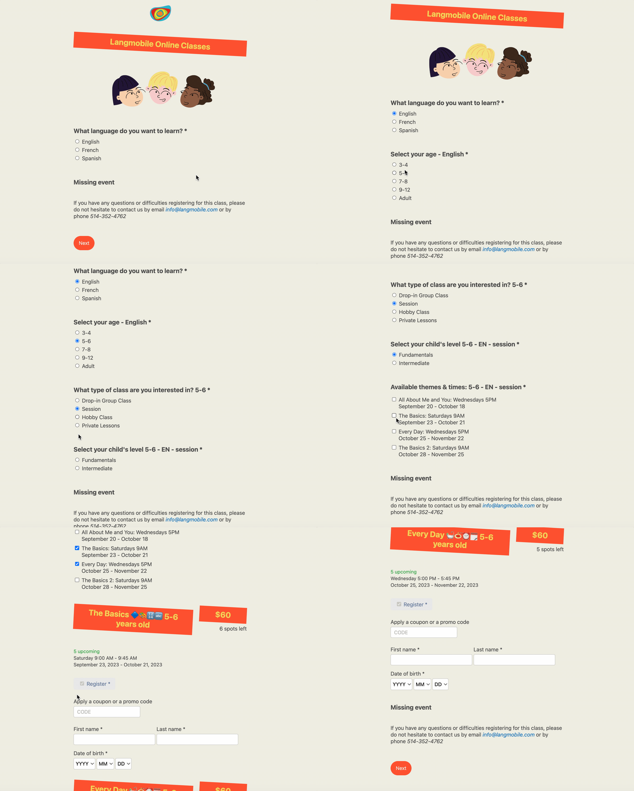
It’s about translating those guiding questions into a workflow that replicates the personal touch of a phone call.
Here’s an example from one of our customers.

Next, we’ll talk about why more clicks to purchase are actually a good thing.
The belief that fewer clicks to purchase improves the customer journey is widespread.
But it too often ignores the nature of the purchase. Amazon’s 1-click checkout thrives on immutable variables.
But when it comes to registering for an activity or camp, it’s far from ideal. Reducing the number of clicks to purchase actually overwhelms customers with options.
The focus should be on optimizing the time between clicks, not reducing the number of clicks.
And the rise of platforms like TikToks and Reels has influenced our behavior, reducing our willingness to spend time browsing static web pages.
Increasing the number of clicks to personalize the customer experience is in line with this trend.
TikToks, Reels and Shorts owe their addictive nature to the way they tap into our brain’s reward system: Dopamine.
The combination of short, personalized feeds and interactive features keeps us coming back for more.
Whether we like it or not, this new content format is influencing our buying behavior.
How? By reducing our willingness to spend time searching and Scroling
Especially on static, hard-to-navigate pages with to many options.
So not only does increasing the number of clicks help personalize the customer experience, it’s also become the preferred way for most people to find what they’re looking for online.
So if finding your online store feels more like a ’90s website than skipping through reels on Instagram, it might be time to start looking for an alternative.
Both are great companies with truly groundbreaking products. Modern registration platforms like Activity Messenger wouldn’t be what they are today without them.
But you’re here for a reason.
And the fact is, older registration platforms offer generic & rigid tools designed to work the same way for everyone.
But your business is unique.
So you shouldn’t have to adapt your business rules to fit the rigidity of your class management software.
So if you’re looking for a modern approach to online registration that delivers a delightful experience, increases sales, and reduces support, you’ve come to the right place. Book a demo today
Learn more
How to increase kids party booking online for your kids’ activity center
Staff management platform (for seasonal & part-time employees)
How to create bulk certificates with our Canva integration