Are your registration forms leaving money on the table?
You’ve worked hard to attract visitors to your website, but if your registration forms aren’t optimized for conversions, you’re missing out on valuable customers.
The good news is that with a few simple tweaks, you can skyrocket your registration form conversion rates and turn more visitors into paying clients.
In this blog post, we’ll share 11 proven strategies to optimize your registration forms for maximum conversions, including:
By the end of this article, you’ll have a list of actionable tips and best practices to create registration forms that not only look great but also convert like crazy.
| Description | Impact | |
|---|---|---|
| 1. Reduce the Number of Fields | Only ask for essential information to keep the form concise and easy to complete. | Lowers form abandonment rates, increasing overall completion. |
| 2. Make the Form Visually Appealing & Easy to Navigate | Use clean design, whitespace, and clear sections to guide users through the form. | Improves user experience and reduces frustration |
| 3. Implement Real-Time Validation | Provide immediate feedback on input errors as users complete the form. | Prevents errors and reduces submission friction, improving completion rate. |
| 4. Remove the Need to Create an Account | Allow users to register without requiring account creation or login. | Reduces barriers to entry, speeding up the registration process |
| 5. Write Clear and Action-Oriented CTAs | Use direct, compelling language like “Sign Up Now” or “Complete Registration” for your call-to-action buttons. | Encourages users to take immediate action, improving conversion rates. |
| 6. Display Trust Signals Near the CTA | Include elements like secure payment logos, testimonials, or security information near the call-to-action. | Builds trust, which can reduce hesitation and improve form completion rates |
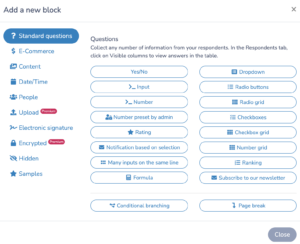
| 7. Choose the Appropriate Input Types for Each Field | Use dropdowns, checkboxes, radio buttons, and text fields wisely based on the information being collected. | Simplifies the form and speeds up completion |
| 8. Minimize Cognitive Load | Limit the amount of information displayed at once, and avoid overwhelming users with too many choices. | Keeps users focused and reduces decision fatigue |
| 9. Organize Fields in a Logical Manner | Group related fields together and follow a logical flow from start to finish. | Makes the form easier to understand and complete, reducing confusion. |
| 10. Benchmark Your Form Conversion Rate | Track and compare your form’s performance against industry averages or your own historical data. | Helps identify areas for improvement and measures the success of optimization efforts. |
| 11. Analyze Factors That Influence Form Conversion Rates | Consider design, user experience, trust signals, and external factors like pricing and urgency when analyzing conversions. | Provides insight into how to further optimize the form to increase registrations. |
Author’s note: Olivier shares tips and tricks he’s learned over the past decade as the owner of a kids’s activity center working with many different online registration tools. Today, as the co-founder of Activity Messenger, he now helps hundreds of organizations in North America improve their online registration process and increase their conversion rates.
When designing your registration form, it’s crucial to ask only for essential information. By minimizing the number of fields, you can significantly increase the likelihood of users completing the form. Move optional fields to a later stage, such as a user profile page, where users can provide additional details at their convenience.
Research has consistently shown that shorter forms have higher completion rates. In fact, a study by Unbounce found that reducing the number of form fields from 11 to 4 resulted in a 120% increase in conversions. Now this might be different when it comes to registration forms but by keeping your form as concise and focused as possible, you can dramatically improve your conversion rates.
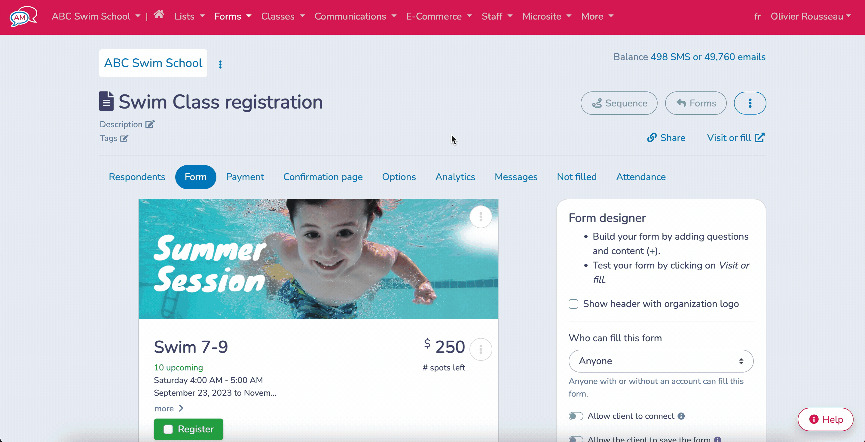
The visual design of your registration form plays a significant role in user engagement and completion rates. To optimize your form’s appearance, use a clean, uncluttered design with ample white space. This approach helps users focus on the essential elements and reduces the likelihood of distraction. A platform like Activity Messenger helps you create registration forms and is fully integrated with Canva allowing you to stay on brand.
Ensure that your form is mobile-friendly and responsive, as an increasing number of users fill out our registration forms through their smartphones and tablets. This is especially true if you work in the sports and recreation industry, where your customers are primarily young parents. A form that is difficult to navigate or complete on a mobile device can lead to frustration and abandonment. Use clear labels and placeholders for each field to guide users through the registration process.
Real-time form validation is a powerful technique for improving user experience and reducing form abandonment. By providing instant feedback for incorrect or missing information, you can help users correct errors as they occur, rather than waiting until they submit the form.
Use positive reinforcement for correctly filled fields, such as green checkmarks or success messages, to encourage users as they progress through the form. This approach minimizes frustration and increases the likelihood of form completion.
Nobody likes to create yet another account. Especially for one-time purchases like a dance class or swim lessons. By allowing users to register without creating an account, you reduce the time and effort required to complete the registration.
By implementing these small tweaks to your registration forms, you can significantly improve your conversion rates and provide a better user experience for your clients.
Your call-to-action (CTA) is the final step in convincing users to complete your registration form. To maximize conversions, use persuasive language that communicates the value of signing up. For example, instead of a generic “Submit” button, try “Get Started” or “Join Now”.
Make sure your CTA button is prominent and easily clickable on all devices. Consider placing the CTA above the fold or using a sticky button that remains visible as users scroll through the form.
To find the most effective CTA for your audience, conduct A/B tests with different variations. Try experimenting with the following elements:
Monitor your conversion rates for each variation and iterate based on the results. What works for one audience may not work for another, so continuous testing is key to optimizing your CTAs.
Even with a compelling CTA, users may hesitate to complete your registration form if they don’t trust your brand. To build credibility and reassure users that their information is safe, display trust signals near the Call-to-Action.
You can link to your privacy policy and terms of service to demonstrate transparency about how you handle user data. If you have testimonials or customer logos, showcase them near the form to provide social proof.
Anticipate the concerns that may prevent users from completing your registration form and address them proactively. For example, if you require credit card information, clarify that you won’t charge users without their permission. If you ask for sensitive data like social security numbers, explain why it’s necessary and how you’ll keep it secure.
By displaying trust signals and addressing common concerns, you can create a sense of safety and reliability that encourages users to follow through with registration.
Activity Messenger is an online registration form builder designed for Dance, Gymnastics, Tennis, Swim and Camps to help you increase revenue and manage your business with a single tool.
Applying user experience (UX) design principles to your registration forms can significantly improve user engagement and increase conversions.
Cognitive load refers to the mental effort required to complete a task, such as filling out a registration form for multiple kids with a dozen class options. When users encounter a form that is too complex or confusing, they may become overwhelmed and abandon the process altogether.
To minimize cognitive load and keep users engaged, consider the following strategies:
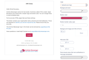
For longer registration forms, it’s essential to break the form into smaller, more manageable sections. This approach allows users to focus on one set of related fields at a time, reducing the feeling of being overwhelmed.
By dividing the form into logical steps, such as “Personal Information,” “Liability Waivers,” and “Class Options,” users can easily track their progress as they complete each section.
In Activity Messenger, you can drag and drop page breaks at key steps of the registration form.
Progressive disclosure is a technique that involves presenting users with only the most essential fields initially, and gradually revealing additional fields as needed. This approach helps to reduce visual clutter and keeps users focused on the most critical information.
For example, if your registration form includes a field for “Participant Name” & “Medical information” you might consider hiding this field by default and only displaying it when the user selects an Activity, Event or Class.
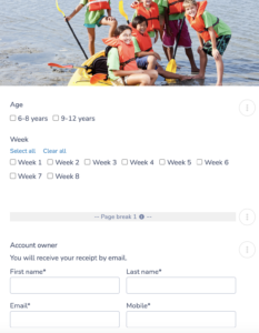
When your registration form includes fields that may be unfamiliar or complex for some users, it’s crucial to provide clear instructions and examples. This guidance helps users understand exactly what information is required and how to format their input correctly.
For instance, if you have a field for “Medical Information,” you might include checkboxes for most common medical information and an other option where people can include more details. Similarly, if you have a field for “Bank account information,” for your staff onboarding, you can provide guidelines or even an image to make sure you collect the right data. 
Selecting the right input type for each form field is crucial for creating a smooth and intuitive registration experience. Dropdown menus, radio buttons, and checkboxes are ideal for fields with a limited set of options, as they help users quickly identify and select the appropriate choice.
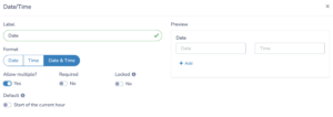
When dealing with date-related fields, implementing a date picker can significantly simplify the input process and reduce the likelihood of errors.
When asking for file uploads, ensure that the process is straightforward and clearly communicated, with support for common file types and reasonable size limits.
The arrangement of form fields plays a significant role in guiding users through the registration process. For instance, placing all contact information fields (name, email, phone) in one section, followed by a separate section for event or class selection, helps users focus on one aspect of the registration at a time.
When designing for mobile devices, opt for a single-column layout. This approach improves readability and reduces the need for horizontal scrolling, which can be cumbersome on smaller screens.
Despite your best efforts to create a user-friendly registration form, errors are bound to occur. When they do, it’s essential to provide clear and helpful error messages. Clearly indicate which fields are causing issues, and offer specific suggestions or examples for correcting the errors. For instance, if a user enters an invalid DOB that does not fit your age constraints, say for a kids gymnastics class, highlight the field and provide an immediate message like “Please enter a valid DOB between X and Y”.

In some cases, users may need to abandon the registration process midway due to unforeseen circumstances. To minimize frustration and increase the likelihood of completion, consider implementing a save and resume feature. This allows users to save their progress and return to the form later, without having to start from scratch.
A registration form conversion rate is the percentage of users who successfully complete and submit a registration form out of the total number of visitors who land on the form page. This metric is crucial for measuring the effectiveness of your registration process and identifying areas for improvement.
Conversion rates can vary significantly depending on factors such as industry, target audience, and form complexity. For example, a simple newsletter signup form might have a higher conversion rate compared to a complex application form for a financial service. According to Formstack’s Form Conversion Report, the average conversion rate for all forms is around 10%.
Several key factors can impact your registration form conversion rates:
The length of your registration form and the perceived effort required to complete it can significantly affect conversion rates. Users are more likely to abandon forms that appear too long or complex. Striking a balance between collecting necessary information and minimizing form fields is essential for optimizing conversions.
The user’s motivation for registering and the perceived value they expect to receive play a significant role in conversion rates. If users believe that the benefits of registering outweigh the effort required to complete the form, they are more likely to convert.
To increase user motivation, clearly communicate the value proposition of registering, such as access to early-bird discounts, limited spots, or special offers.
Trust and credibility are critical factors in a user’s decision to complete a registration form. If users do not trust your website or brand, they may hesitate to provide personal information.
To build trust, ensure your website has a professional design, prominently display privacy policies and security measures, and include social proof such as customer testimonials or trust badges.
Most platforms use generic, uncustomizable portals for registrations that do not reflect the original site’s look and feel. These portals often have different colors, fonts, and layouts, which can disrupt the user’s experience and make them hesitant to share their personal details.
By contrast, maintaining a seamless, fully branded experience—from your website to checkout—helps reassure users that they are still engaging with the same trusted organization. You can significantly reduce form abandonment and improve your conversion rates by embedding your registration form on your website.
To set realistic goals and measure the success of your registration form optimization efforts, it’s essential to benchmark your conversion rate against industry standards and competitors.
Start by researching industry averages and best practices for registration form conversion rates. Resources such as Formstack’s Form Conversion Report and Unbounce’s Conversion Benchmark Report provide valuable insights into average conversion rates across various industries and form types.
Keep in mind that your unique context, such as target audience and form complexity, will influence your specific goals and optimization strategies.
Most importantly, make sure your registration platform allows you to track conversion rates. Many online registration software do not display conversion rates, making it difficult for you to determine how optimized your form really is.
Making small tweaks to your registration forms can lead to significant improvements in conversion rates. By reducing the number of form fields, designing an appealing layout, and implementing real-time validation, you’ll create a seamless user experience that encourages more sign-ups.
Implement these 11 simple changes to your registration forms and watch your conversion rates soar. Start by streamlining your form fields, craft compelling CTAs, and apply form design best practices. Remember to continuously test and optimize your forms to stay ahead of user preferences and industry benchmarks.
Which of these changes will you implement first to skyrocket your registration form conversions?


